Around the World in 80 Meals
A Case Study
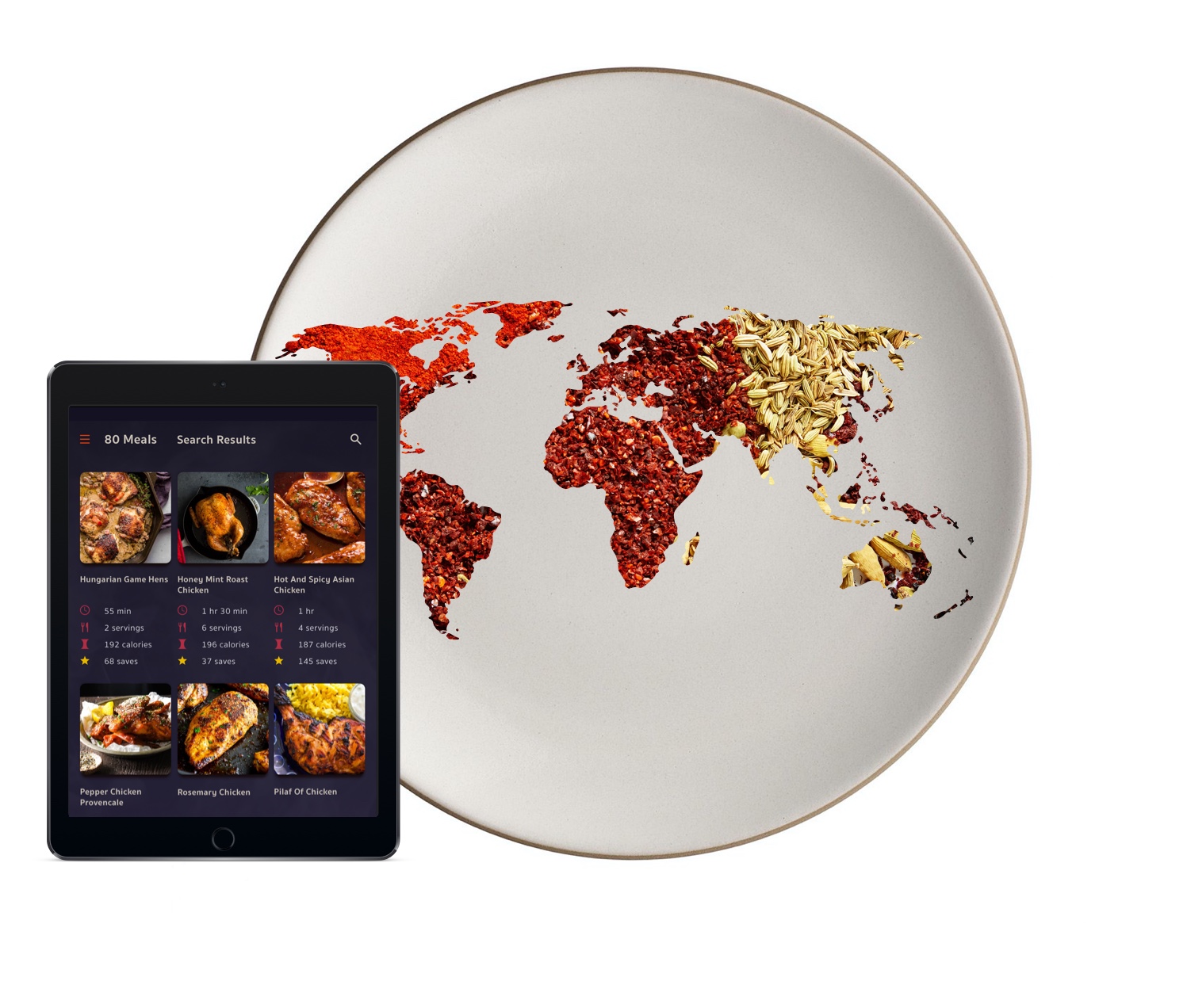
About:
Around the World in 80 Meals is a responsive web application for the serious home chef. Find instant access to recipes from all around the globe. Explore unique features such as side-by-side recipe comparisons and the swap library.
Travelling with your taste buds has never been more accessible.
Role: UI/UX Design, Research, and Testing
Project scale: 2 months
Produced for: Career Foundry UI Course
User Research
I selected interview candidates across a spectrum of age, race, and professions, who all shared a noted penchant for exploratory home cooking.
Each user engaged in a half-hour video interview covering their cooking habits, food preferences, and experience with recipe apps on the market.
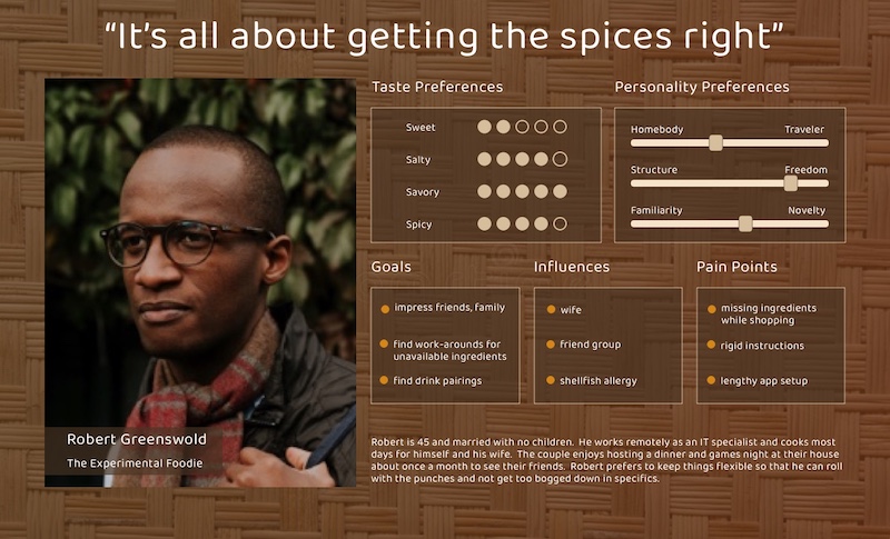
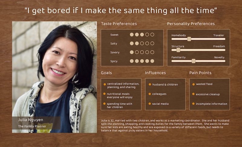
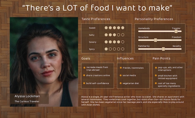
From those interviews I distilled the recurring themes, desires, and concerns into three personas to guide the app development process.
Paper Prototype
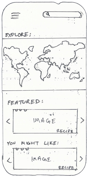
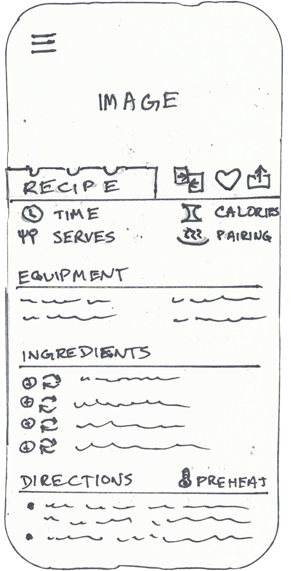
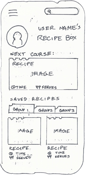
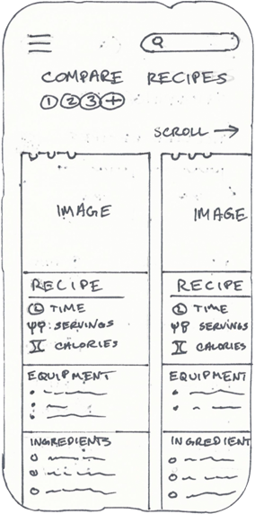
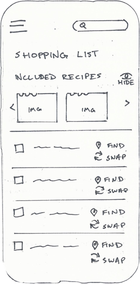
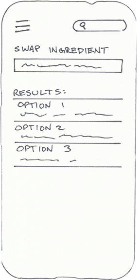
With the goals of the personas in mind, I embarked on a rapid series of sketches in order to form a paper prototype to take into user testing.
Two unique features for the app came directly from user desires identified during the research phase: the recipe comparison screen and the swap library.
Preference Testing
Alongside the paper prototype, I created two stylistic variants of the app landing page and set up an online A/B preference test on UsabilityHub.
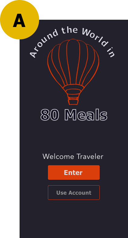
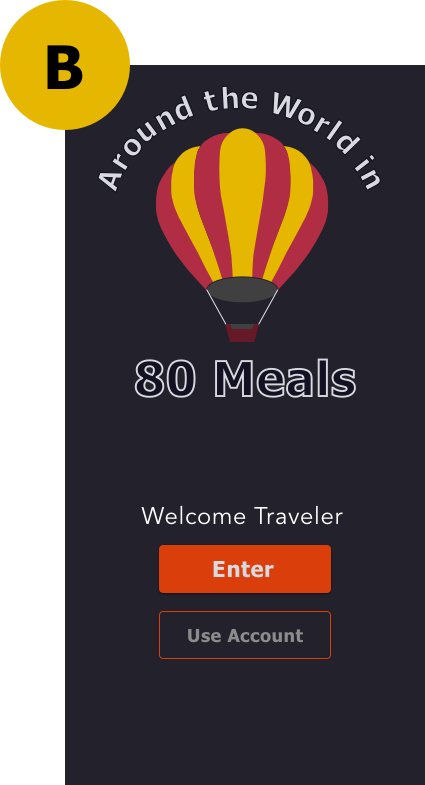
73% of test participants preferred option B, indicating a clear and significant preference for bold and solid color over the more sketch-like style of option A.
Styling
With data from both sets of user tests, the following style guide developed.
Typography
Aa
Headings: Sukhumvit Set Bold
Copy: Sukhumvit Set Regular
ABCDEFGHIJKLMNOPQRSTUVWXYZ
abcdefghijklmnopqrstuvwxyz
01
Numbers: Galvji Regular
1 2 3 4 5 6 7 8 9 0
Copy Guide
Language throughout the app will be written in a professional, informative tone. Words and metaphor reflective of travel and exploration should be used where appropriate. This site aims to express delight, knowledge, and richness of experience.
Color Palette
Logo
Around the World in 80 Meals plays, of course, on the title of Jules Verne’s 1872 adventure novel.
The hot air balloon of the logo emulates that spirit of adventure. The scaleable vector graphic is composed of multiple layered curves and boolean shapes to achieve this colorful and recognizable form.
Over the course of testing and refinement, the logo evolved from the initial image used in the preference test to the form seen here.
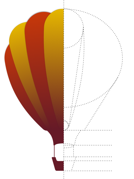
Logo Construction

Menu Logo
App Icon
User Interface Design
01
Access
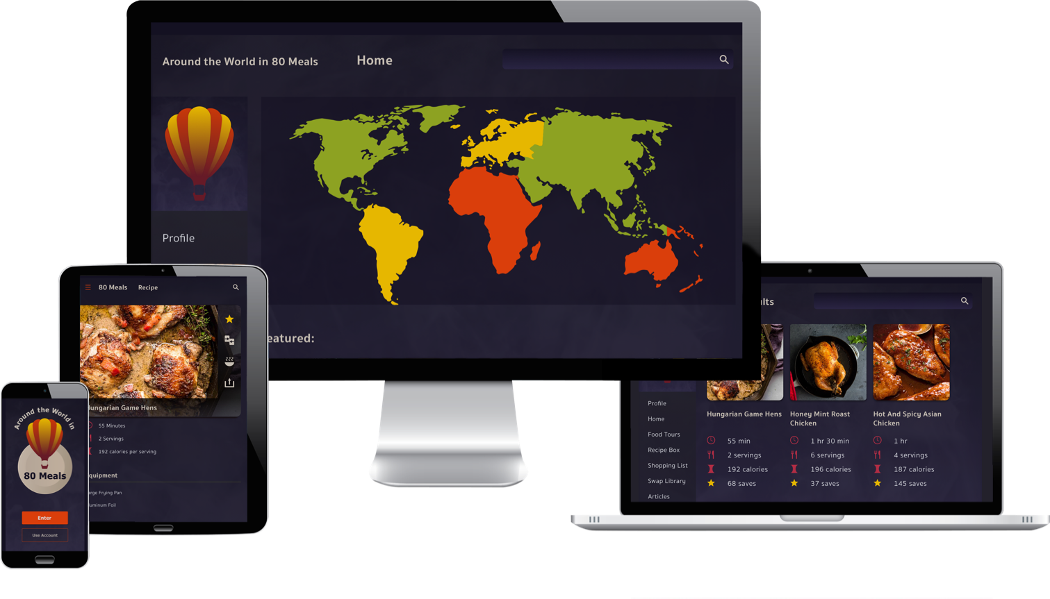
Designed on a 12 column responsive grid,
Including multiple breakpoints,
Users can access the site anywhere from any device.
02
Explore
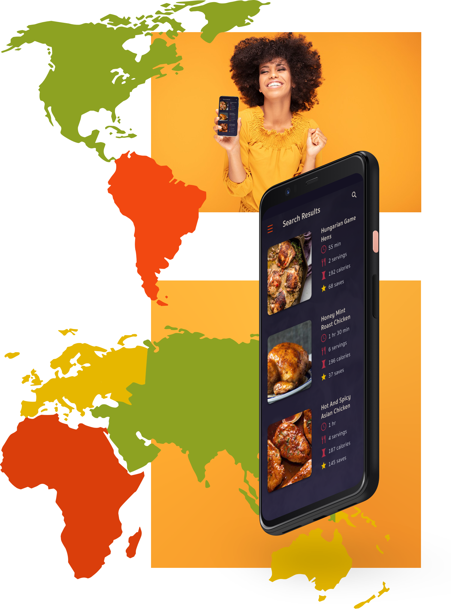
Search the world for international flavors.
Use the world map to explore recipes by region.
Or simply search what you’re craving. Anyone for chicken?
03
Compare
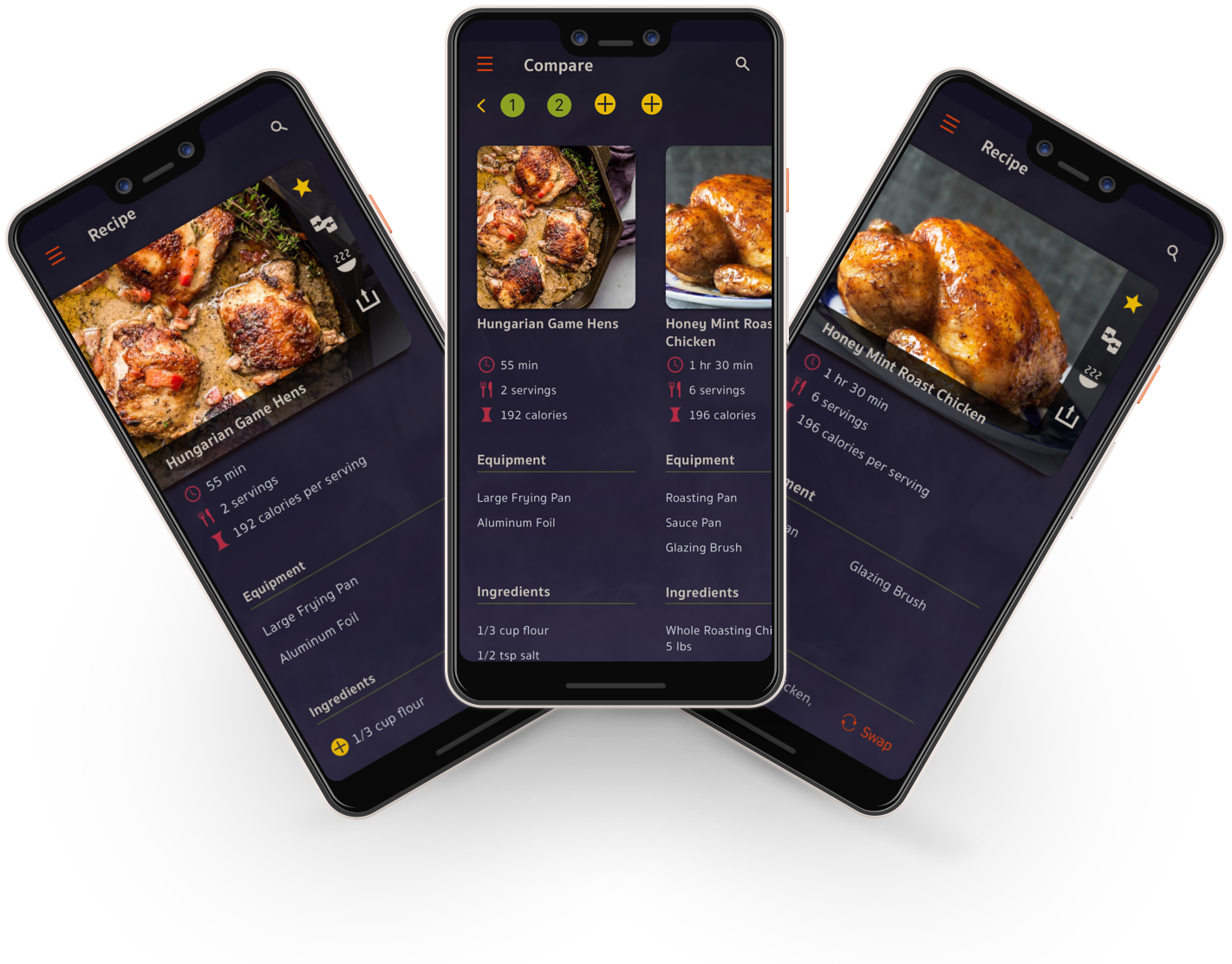
Compare recipes side by side to find your favorite.
See up to 4 recipes simultaneously.
04
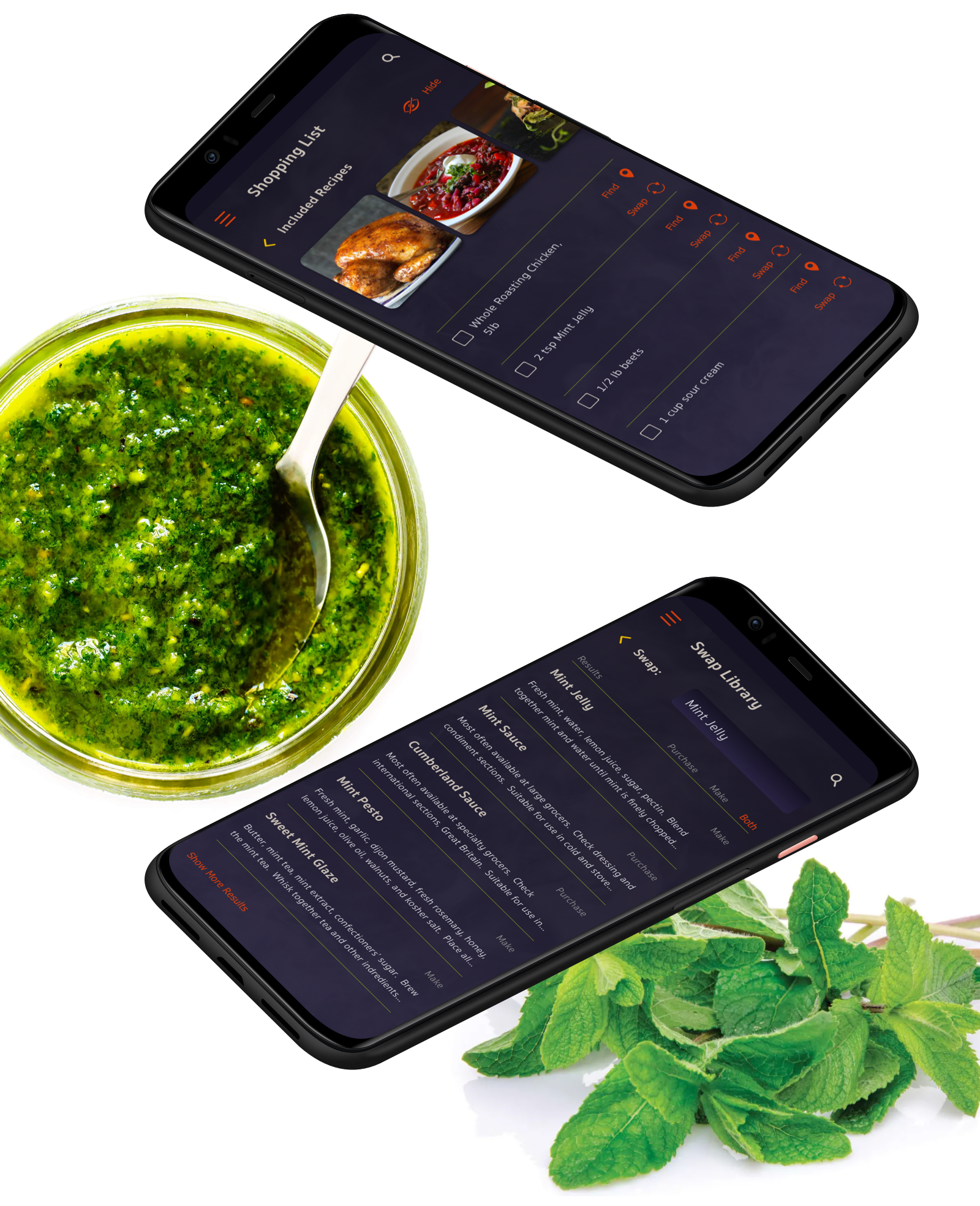
Shop and Swap
Create in-app shopping lists from your saved recipes.
Can’t find an ingredient you need? Swap it out!
The swap library offers a comprehensive database of ingredient substitutions.
05
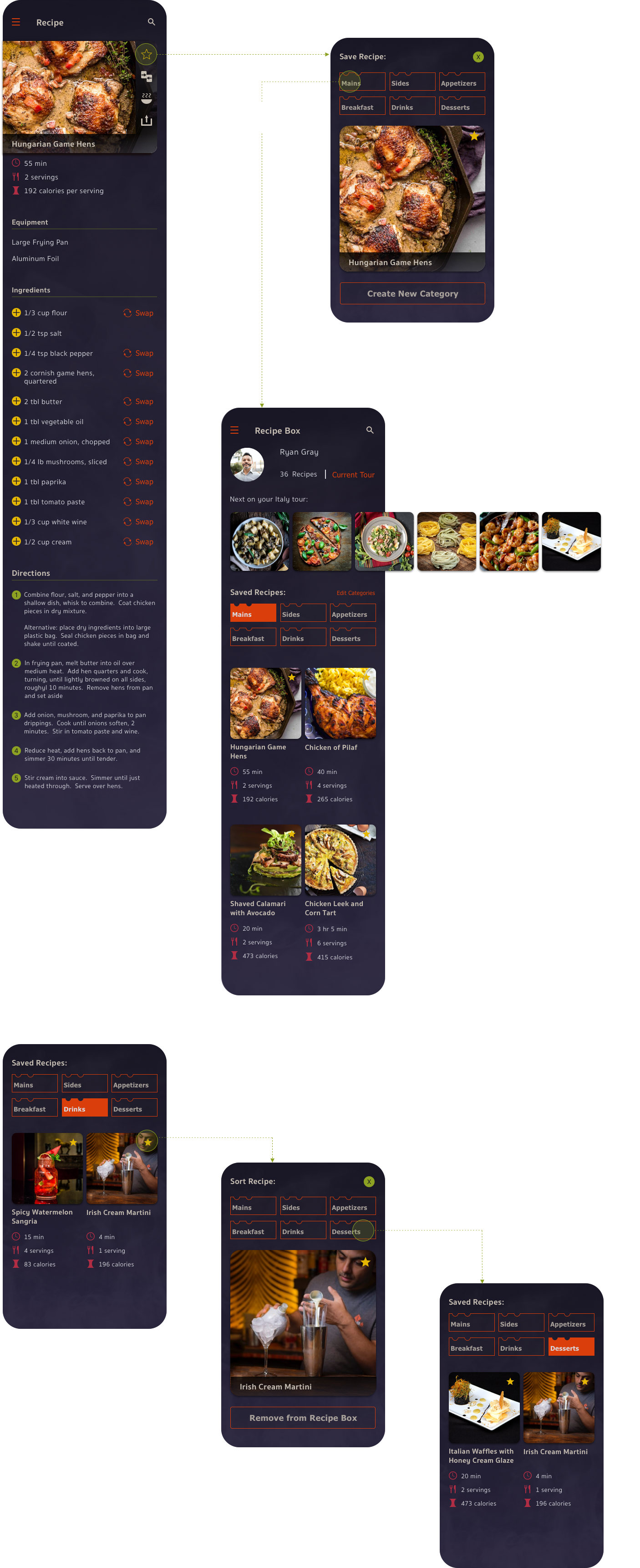
Organize
Save your favorites and assign your recipes to custom categories.
Changed your mind? Easily organize your recipes your way.
Take a guided tour through regional cuisines with pre-selected courses or forge your own path.
Remove guesswork, focus on flavor families, and manage ingredients to reduce waste.
Future Thoughts
User research and testing grounded the design process for Around the World in 80 Meals. Certain ideas, like comparing recipes and swapping ingredients, came entirely from the users themselves.
Many flows and features, however, had to be left on the cutting room floor.
Around the World in 80 Meals originally included a section for linked articles as well as reviews, which would supplement the recipes and give users the option of learning about the cultural history of dishes and ingredients in more depth.
The users who participated in the initial research all expressed interest in this feature, but it simply did not rate highly enough to make the MVP.
This expanded knowledge center would be a great feature set to revisit future iterations of the app.