Bullet Journal App

Case Study
Role: UI Designer
Project Scale: 2 weeks
Produced for Career Foundry UI Course
About
Combines the freedom of a bullet journal with the convenience of digital form.
View by subject or by timeline.
This is organization for a beautiful life.
Initial Steps
I began with a research dive into other applications available on the market. The competitor analysis ranged across note-taking, to-do lists, and diary apps. I also spent some time in casual conversation and on forums with active users of analog bullet journaling to identify common themes, needs, and uses. From these first casual interactions I developed initial paper sketches.
Structure
After this anchoring exercise to help set direction and scope for the project, I examined the more commercial end of bullet journaling.
I was particularly fascinated to discover a cottage industry of artists that made and sold prefabricated pages for bullet journals. These prefabrications set up a unifying structure for the journal while still centering on the user’s input.
With this in mind, I expanded into a few more screens in paper sketch, and then developed those into wireframes in Sketch.

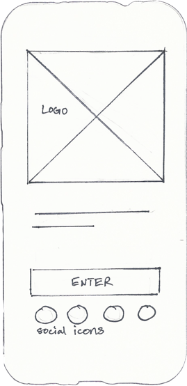
Welcome screen used only for first time opening the app after download, or after data wipe.
Users can create account manually, or use an existing social media profile to expedite the process.
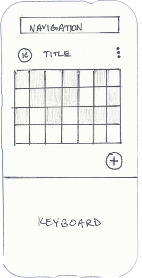
The timeline page is the default landing page for returning users.
Timeline can always be accessed via the top navigation bar (center icon).
All user inputs are displayed in chronological order.
View timeline detail by month, week, or day, with horizontal selection to advance or move back in time.
The Index page can always be reached via the upper navigation bar (far right icon button).
Secondary navigation switches views between master lists, of each input type: checklists, trackers, log sheets, and notes.
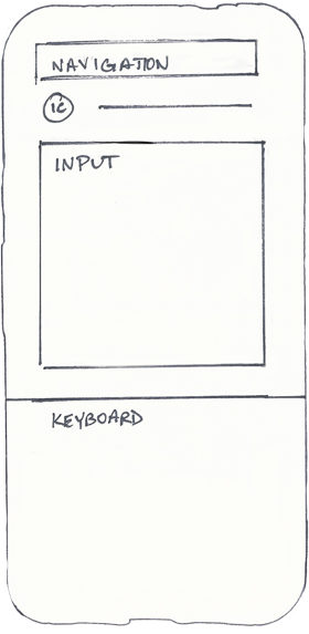
From the master subject list, select an individual entry to edit it.
Kebab menu includes date assignment, renaming option, entry deletion, and additional options specific to each input type.
Styling
The app aimed for a clean but whimsical tone. Typography, color, and icon design all reflect this goal to balance the crisp legibility of a planning app with the needed touch of whimsy inherent to the bullet journaling community.
Typography
Title: Zapfino
Headings: Optima
Copy: Tahoma
Color Palette
Dominant Colors
#1D1D1D
#404040
#74C2BB
#FFFFFF
Support Colors
#518A85
#C9EFEC
#FFDFD6
#989898
Accent Colors
#60290D
#F69479
#EEE8DC
Iconography
Profile
Calendar
Index
Checklist
Tracker
Logsheet
Note
Interface Design
Here are the resulting screen designs after everything was put together.


