Changes
Money can change your life.
You can change your habits.
We can help with both.
Case Study by Carolyn Voss
Role: UI/UX Design, Prototyping, and User Testing
Project scale: 1 month
Produced for Career Foundry UI Course
About Changes
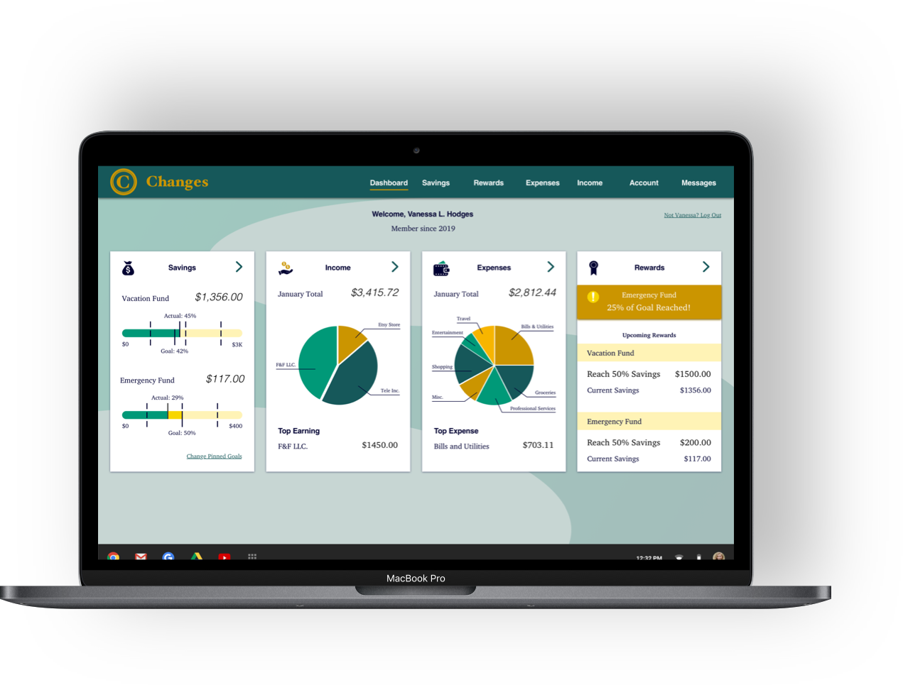
Changes is a web-responsive financial planning app.
- Set flexible savings goal.
- Track income and expenses.
- Get rewards.
We make it easy to stay on top of your money.
Branding
The development process began with the branding guide.
Key brand values taken from company mission statement.
Color Palette
Greens and Golds
Wealth and Growth
Mint
#C7D6D3
Teal
#16585A
Gold
#CB9500
White
#FFFFFF
Wheat
#FFF3B6
Yellow
#F7D600
Emerald
#009978
Midnight
#000033
Typography
Clean and open
Helvetica titles
Formal and reliable
Charter body copy
Helvetica
Light oblique
BoldCharter
Roman
Bold
Iconography
Icons in midnight
match body copy.
Quick to inform,
but not to distract.
User Experience
The project brief contained user stories.
Those stories then helped guide initial design solutions.

Problems
“I want to see a dashboard of my finances clearly and visually, so that I can see how much I am spending on what at a glance.”
“I need to be able to tell the tool what my savings goal is and how long I have to reach it, so that I can save accordingly.”
“I want to receive a personalized savings plan, so that I can save enough money to reach my goal in time.”
“I want to see an overview of how much my finances have changed and how much I am saving throughout the saving period, so that I can stay on track.”
“I want to be notified and rewarded when I have reached certain milestones throughout the saving period.”
Solutions
A dashboard landing page that displays at-a-glance visuals for savings, income, and expenses
An onboarding flow that allows users to input their basic figures and time line, which then automatically generates a savings plan. Allows for additions and modifications
Nested levels of information allowing users to see big picture items first before accessing more granular levels of information and control.
A dedicated rewards center, with multiple access paths, and opt-in push notifications
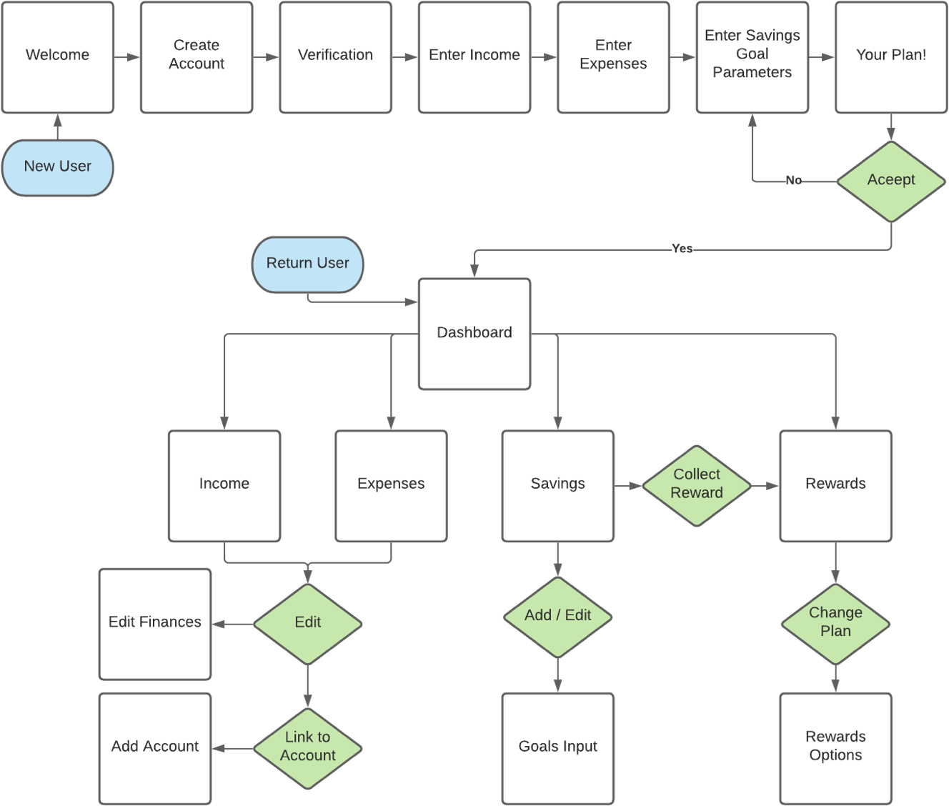
User Flow
From the user stories and solutions developed the user flow diagram.
This diagram was made using LucidChart.
Development and Testing
With app structure now outlined, sketches began.
Sketches became wireframes.
And wireframes became the prototype for user testing.
This prototype was created with InVision, and you can see the living version here.
User Testing Results
Positive Responses
- Financial Breakdowns are very legible
- Visual displays are engaging
- Onboarding steps are very clear
- Aprreciate multiple pathways to Rewards Center
"I think it's great to have the quick, at-a-glance!"
"That was simple!"
Pain Points
- Not enough information on pie charts
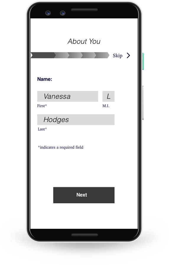
- Onboarding progress bar is confusing
- Rewards Center does not stand out
- Main page backgrounds are too busy
Interface Design
With user preferences and pain points in mind,
the app moved into revisions for high fidelity screens.
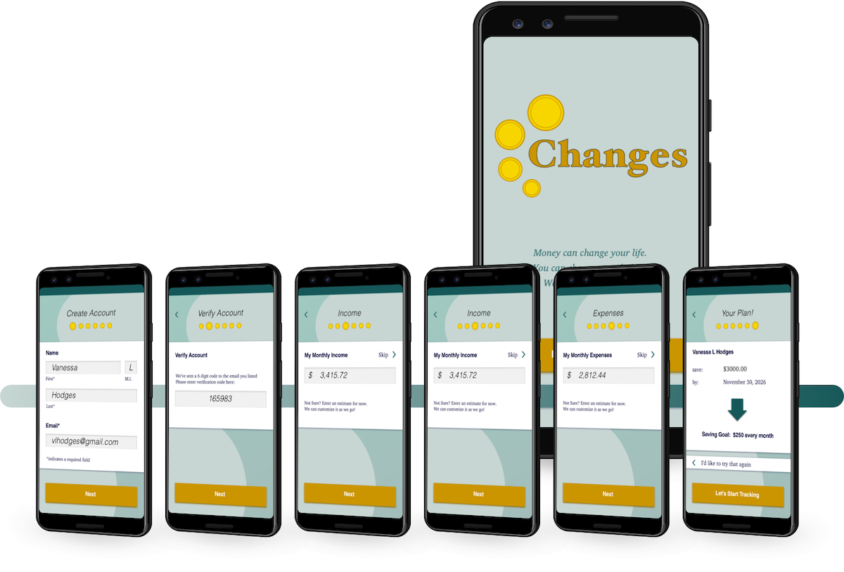
New User Onboarding
6 simple steps to create an account
and set your first savings goal.
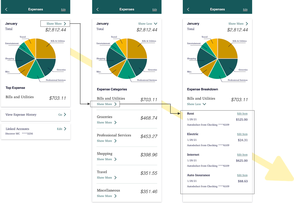
Granular Control
Nested information lets you decide how much detail to see on screen.
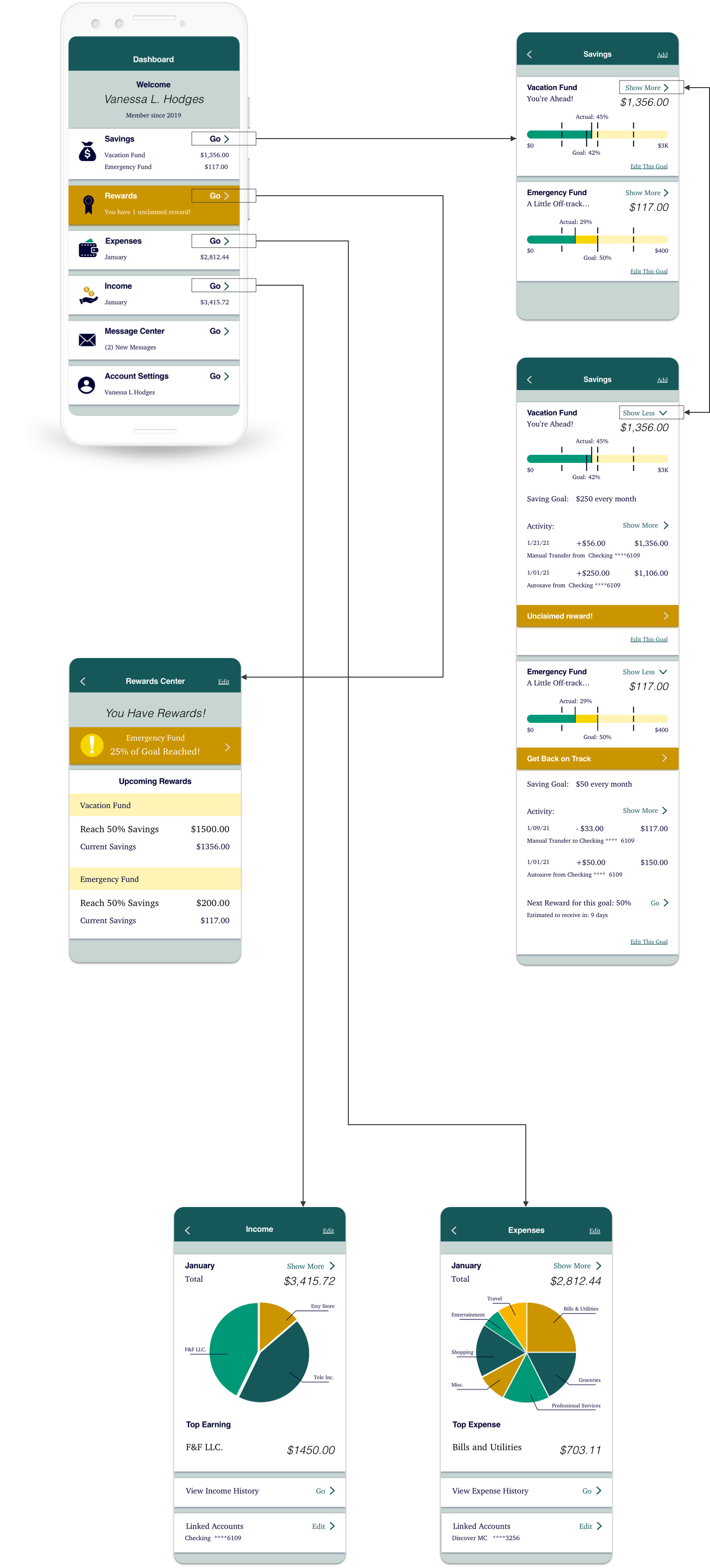
See the Big Picture
Your dashboard can take you everywhere you need to go.
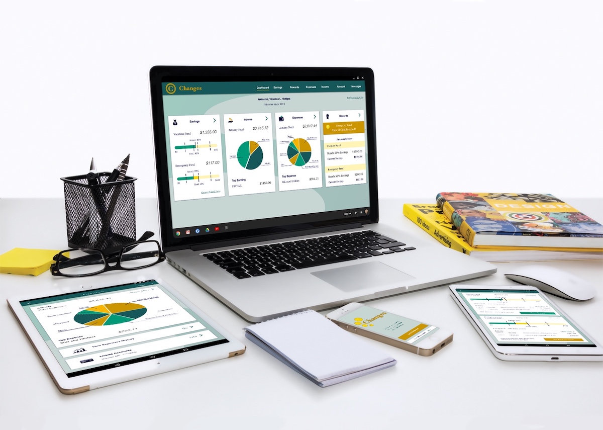
Responsive Grid Layout
Designed for multiple breakpoints.
Changes can be accessed on any device.
Looking Forward
Simplicity is key for the Changes app.
As the product expands and develops, everything we introduce will be weighed against keeping the app easy to read and easy to use.
We'll be building on what we have:
- Linked account screens
- Goal editing screens
And on the horizon our users might see:
- Native money transfer
- In-app bill payment
- Investment tie-ins
One thing you can count on:
There will be changes to come.
