Space Imagined

Case Study
While there are many ways to plan and undertake the process of home decor, few if any applications offer a fast and easy way to mock up an idea against reality.
Space Imagined makes use of the phone’s onboard camera in conjunction with simple editing tools to allow users to see what their space might look like with a new painting, a different couch, or an alternate arrangement of last year’s holiday decorations.
The app allows users to manipulate augmented reality objects to create interior design mockups, share their visions, and purchase the items that turn visions into reality.
Design a new look for your home with minimal effort, before you buy!
Native application for iOS and Android mobile devices.
- Role: UI Designer
- Project Scale: 1 month
- Produced for: Career Foundry UI Course
User Flow Diagram
I developed several user flows around the initial concept.
This preliminary structure centered wholly on augmented reality objects as wells as universal camera abilities native to mobile devices.
This diagram was constructed using LucidChart.

Native App Structure
Space Imagined needed to function for both iOS and Android devices.
As I moved into wireframes, I made frequent reference to both Material Designs and the Human Interface Guidelines to bring both versions of the app in-line with the discrete requirements and stylistic preferences of each operating system.
This woud capitalize on user familiarity with device-specific aesthetics and patterns.
All wireframes and screen mockups for this project were created in Sketch.
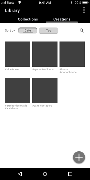
Android Wireframes
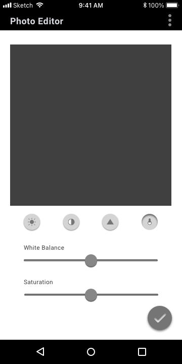
Select / deselect states shown via neumorphic shading.
Haptic feedback of soft clicking during adjustments.
Android’s onboard navigation includes a persistent back button.
In secondary navigation, current selection is indicated by the underline bar.
Add icon displays subtle shading, reflecting Android tendency towards left/right orientation.
Persistent top-level navigation via upper title bar.
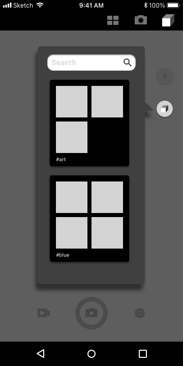
Persistent search input to find AR objects quickly.
Objects are collected under #tags that default to alphabetical arrangement for browsing.
Pop-up modal uses heavy shadow, additionally offset by darkened screen, indicating temporary disabling.
iPhone Wireframes
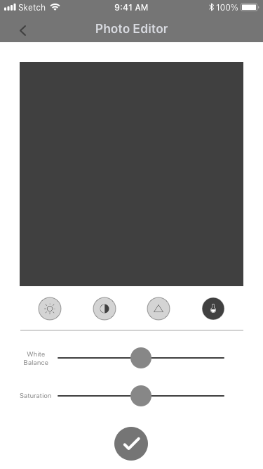
Back arrow appears for navigation to higher level screens when persistent navigation is disabled.
Select / deselect states communicated via color.
Sliders in flat design aesthetic.
Haptic feedback of soft clicking during adjustments.
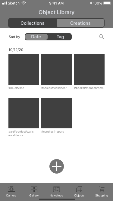
In secondary navigation, current selection is indicated by the active state container.
Add icon displays flat design, reflecting iOS tendency towards centered orientation.
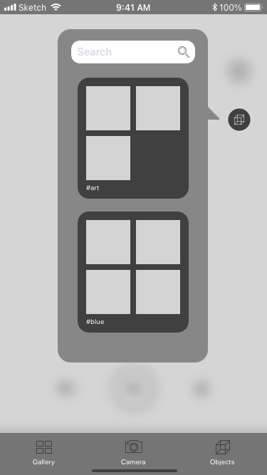
Persistent search input to find AR objects quickly.
Objects are collected under #tags, default alphabetical arrangement for browsing.
Pop-up modal offset by heavy screen blur on underlying window, indicating temporary disabling.
Persistent top-level navigation via bottom menu bar.
Styling and Development
Research into similar competitor apps led to the decisions to build out the commerce end of the app. At this juncture, I also expanded the app to include a social feature that had emerged as a common feature from the research phase.
Once the new screens went into development, the style sheet emerged.
Imagery

Photography used on the site and in promotions is to be well-composed, well-lit, and polished.
Augmented reality objects are distinguished by blue outlining and manipulation controls during insertion. These guides disappear after the object is locked into the composition, and reappear only if the object is first re-activated.
3D object models used for the AR interface should appear photo-realistic in their final rendered form.
Color Palette
Neutral tones formed the basis of the palette, with infusions of blue for links and calls to action.
Typography
Each version of the app uses the the preferred text of its operating system: Roboto for Android and SF Pro for iOS.
| iOS | Android | |
|---|---|---|
| Heading | SF Pro Display Semibold 18 #454545 | Roboto Bold 18 #454545 |
| Subheading | SF Pro Display Semibold 15 #C8C8C8 | Roboto Bold 15 #C8C8C8 |
| Menu Selected | SF Pro Rounded Regular 10 #2D57D2 | Roboto Regular 15 #2D57D2 |
| Menu Deselected | SF Pro Rounded Regular 10 #4D4D4D | Roboto Regular 15 #4D4D4D |
| Body Copy | SF Pro Rounded Regular 12 #404040 | Roboto Regular 12 #404040 |
| Labels | SF Pro Rounded Regular 10 #999999 | Roboto Regular 10 #999999 |
Button Styles
Button styling follows preferred aesthetics of each system:
flat design for iOS, and neumorphic shading for Android.
iOS
Android
Iconography
For iOS, the icons are outlines, in keeping with the lighter tone and trend in iOS icon families. For Android, the app uses solid icons on theme with most Android icon families.
iOS
Android
Challenge and Revision
As new flows developed to expand the app’s functionality, the feature for user-created AR objects began to feel increasingly out of place. User testing in the prototype mockup phase also revealed that about 2/3 of users found this feature in particular to be confusing.
After careful consideration, and keeping in mind the principles of streamlining for MAYA (most advanced yet acceptable) results, I made the decision to remove the AR object creator feature from the product.
User testing also demonstrated that the app’s function, being somewhat niche, was not immediately evident to the average person.
I had always intended the product to have an onboarding flow. And so, taking my cue from the user testing, I started the onboarding flow by answering exactly that question: "What does it do?"

Final Designs
iOS


Android


Looking Forward
In the next stage of development, I could see building out the onboarding experience to include walkthroughs and tooltips to really acquaint users with all the app’s features and functions.
I would also be interested in revisiting the idea of user-created augmented reality plugins for a different app. That core idea still seems useful and intriguing, though not the right solution for this project.